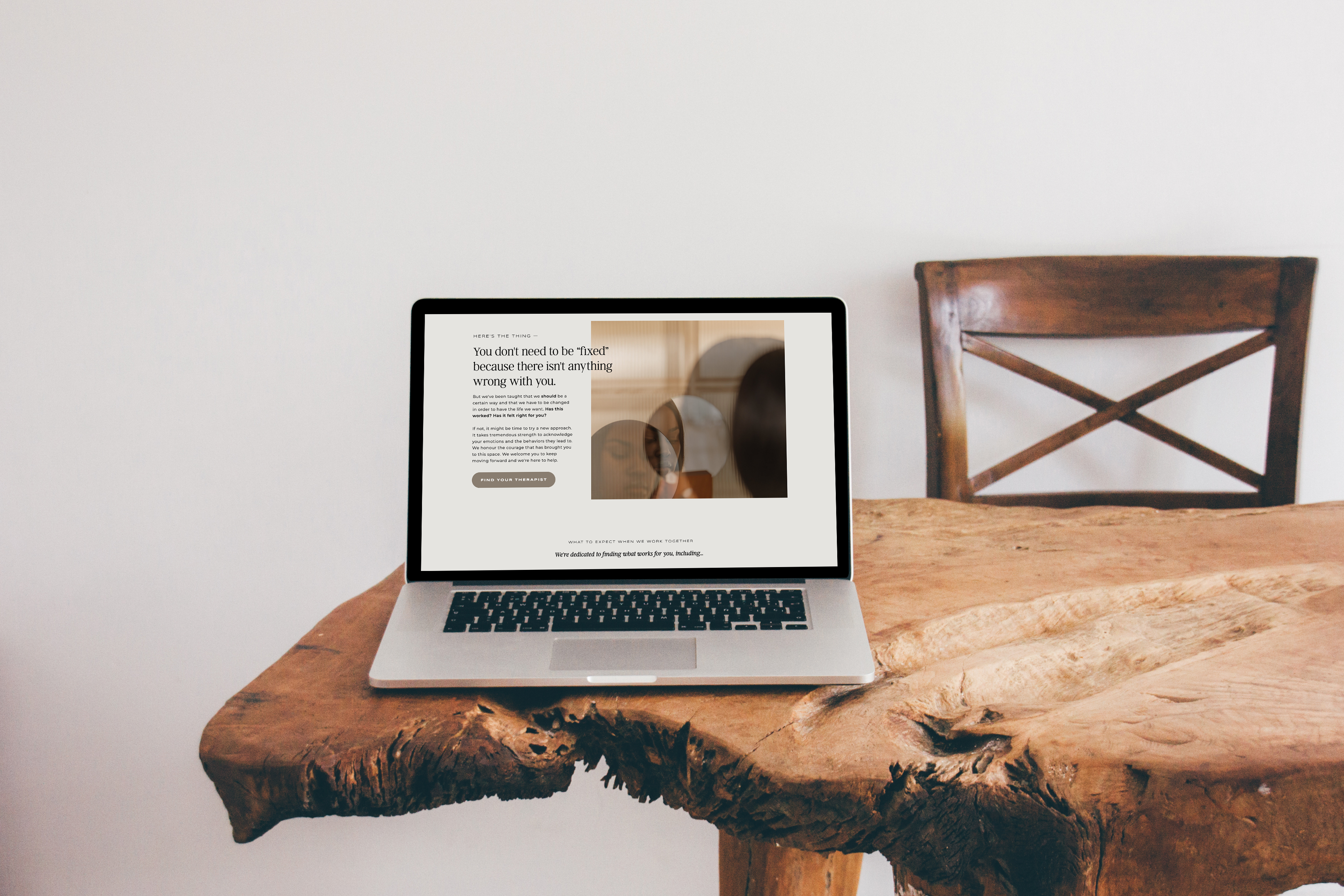
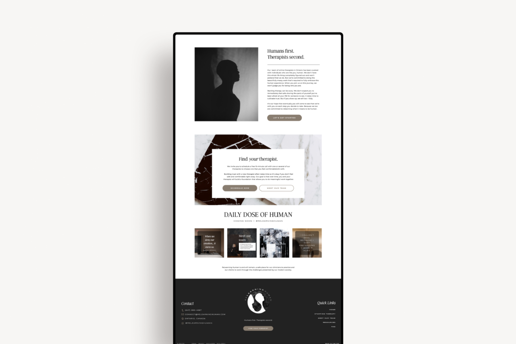
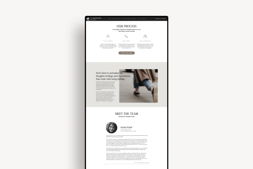
Humans first. Therapists second.
Annie and Kavita saw a gap in their industry. They set out to create a space to provide online therapy to support people through the challenging and painful experiences of life while cultivating a deeper understanding of what it means to be human — and what it looks like to be human for each individual.
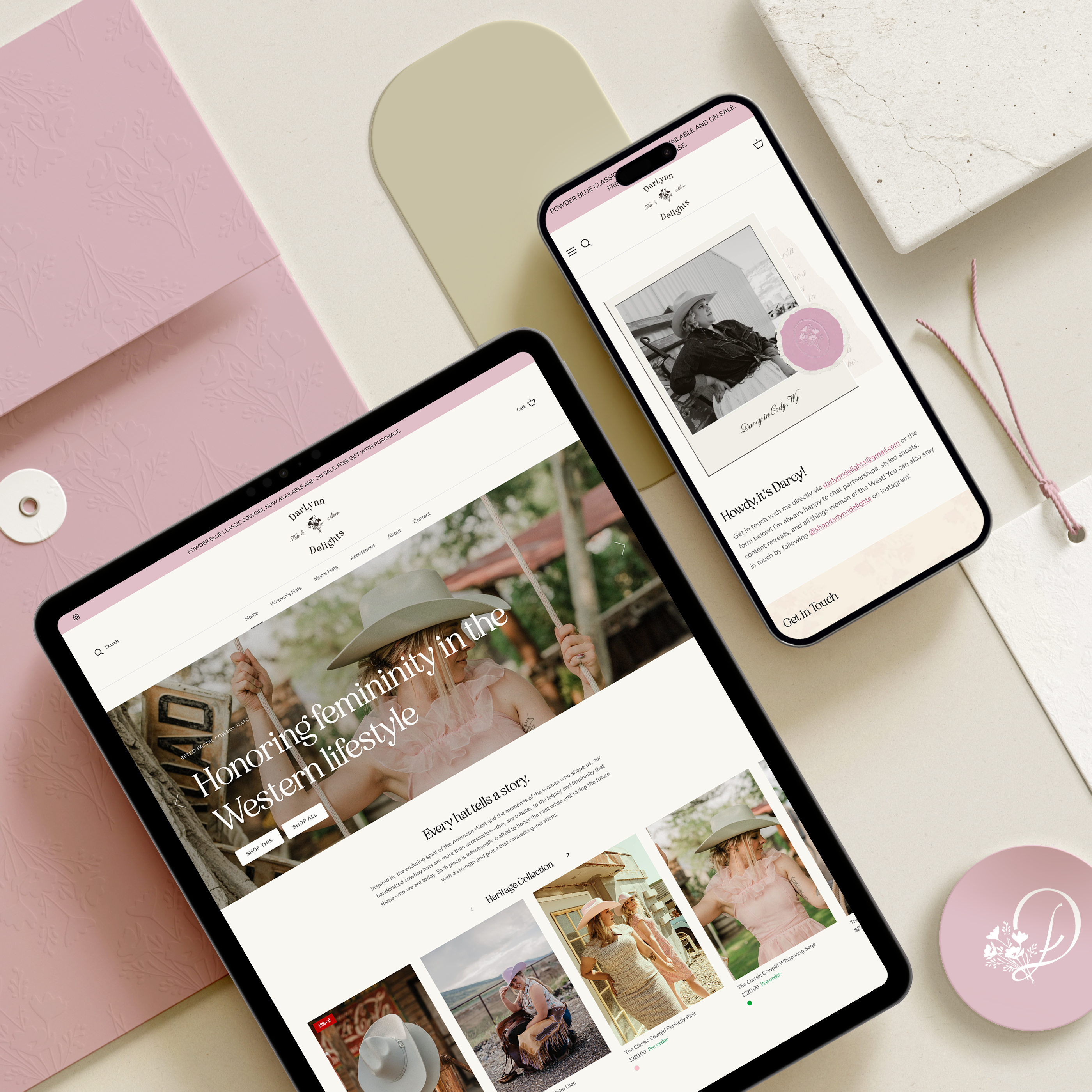
Their project focused on strong brand identity, copywriting, and website design. We also added on workbook, social media post, and sticker design, as well as a new partners page as their practice has expanded!
Annie and Kavita’s project is a great example of the difference between finding a random logo or website template and investing in a strategy rooted in meaning and purpose.
Every aspect of their new website below speaks to the duality of our human experience. Raw, blurry photos are softened by rounded, neutral-toned buttons. Their refreshed custom illustrated logo is trippy and grungy, yet clean and simple. The neutral color palette invites people to explore their offerings and themselves, without suggesting their experience should look any one way.
“Amy’s professionalism and ability to connect human-human without the bulls***, fluff and ego is so refreshing and rare.
Her curiosity, patience and encouragement felt safe and provided a space to collaborate and create a beautiful piece of work.” — Kavita
“Amy took a foreign, nebulous concept and brought it to life.
From the very first meeting I have felt supported, validated and understood which is hard considering sometimes I don’t understand myself!” — Annie


")


Read the Comments +