Gloves for Grief wasn’t born from a desire to build just another grief support group. It started from a shared experience of unthinkable loss, a deep ache that co-founders Terra Pickett and Ashley Guarrasi knew all too well. But rather than letting their grief be something to simply endure, they saw it as something to rise through. They asked, “What if grief didn’t just have to be survived? What if it could become the very thing that fueled our comeback?”
From this pivotal question, Gloves for Grief was born. A community that wasn’t just focused on helping people through their grief—but empowering them to move through it, to rebuild, to connect, and to find strength in the process. It was about showing up as you are, but also stepping into the space where healing isn’t just a passive experience. This community was designed to bring people together to take action—action that leads to healing, not just surviving.
Ashley and Terra came to me needing an online experience that was as impactful as their in-person event experiences. And they needed it FAST because the momentum they’ve been creating in their organization has been unreal. A testament to how important and needed this community is.
The Heart of the Story
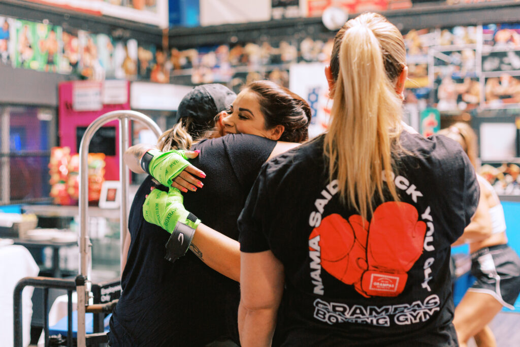
The heart of Gloves for Grief is simple: resilience. This brand isn’t about softening the blow of loss, but about facing grief head-on and using that energy to propel yourself forward. That’s why the brand’s foundation was built with this energy in mind. They wanted to create more than just a place for support—they wanted to make it a space for champions, for warriors, for those who are fighting not just for healing, but for their comeback. It’s a movement that celebrates strength, but also acknowledges the fight it takes to get there.
Celebrating the Work We’ve Done Together
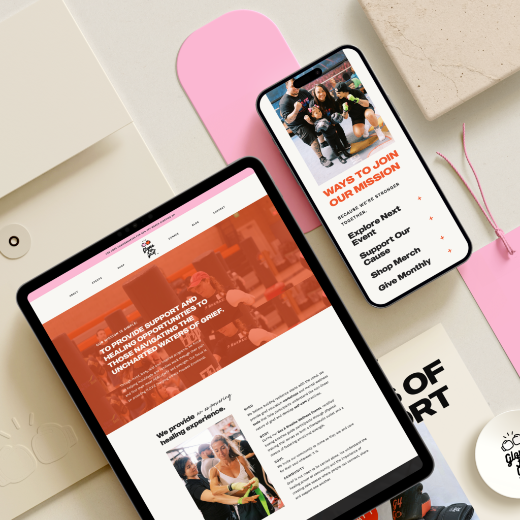
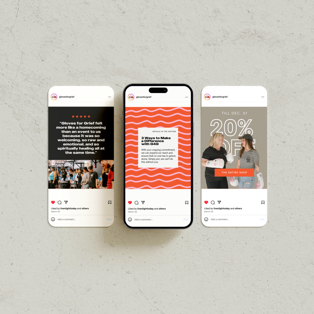
In our work together, we’ve done more than just build a website. We’ve created an experience; a digital space that brings the in-person events and powerful connections online. From social media templates to email designs, ongoing strategy support, and even Shopify integration for merchandise and wellness products, every element has been designed to extend the reach and impact of Gloves for Grief.
We’ve even partnered with other incredible creators like Katie Wyer Art. Together, we hosted a virtual fundraising event featuring Katie’s piece A Peaceful Warrior, which was a true embodiment of the brand’s spirit—messages like “breathe, believe, release, receive,” wrapped in colors that speak directly to the brand’s soul. The online raffle was a testament to what happens when the brand, website, and business are perfectly aligned with the needs and desires of the audience. The winner was so moved by the piece that they made an unexpected additional donation, showing just how much alignment can multiply impact.
This ongoing collaboration has led us to explore even more ways to bring value to the community, including expanding the website to offer virtual support groups, blogs, downloadable resources, and event highlights. We’re making sure that the brand experience is as easy to navigate as it is impactful, so that each person who interacts with it can feel the story unfolding and be empowered to continue their own healing journey.

Building a Brand That Speaks to the Soul
The key to creating something that resonates isn’t just the vision. It’s about connecting that vision to every detail of the brand. From the bold colors to the energetic fonts, and from the wording to the videography, everything about Gloves for Grief was designed to reflect the fierce, resilient spirit at the core of this community. The focus was about standing tall, working together, and finding power in the shared experience of grief. This wasn’t just another support group. It was a call to action.
When I worked with Gloves for Grief to build their online presence, we focused on creating a site that matched their energy. The home page had to be alive. It had to reflect a brand that wasn’t shy about confronting grief and turning it into a source of strength. It was about creating something that people could rally around, a space that felt like they were not just attending a group, but joining a movement. The design and messaging aligned with the very spirit of the brand—bold, energetic, and full of heart.
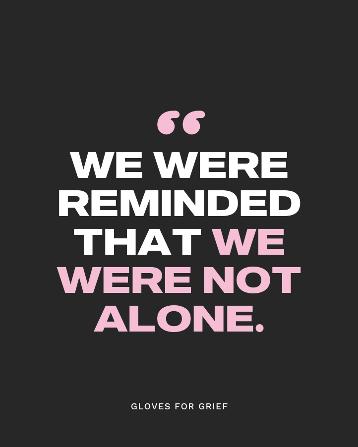
“Connecting with you at the beginning of our journey so clearly paved the road we walked down, and your creative vision made it understandable and relatable to all. Basically saying… you’re the bomb. I am constantly getting compliments on the website. So grateful for you and this impactful online presence. ” — Terra
Finding Your Story in Your Brand
There’s power in building a brand around something that matters to you. When you can tell the truth of your story, even in the tough moments, it becomes the heart of your business. That’s exactly what Gloves for Grief did. They took their personal journeys through loss and turned them into a shared story of hope, resilience, and connection. They built a community that has rallied behind everything they’ve done. And they’re nowhere near slowing down.
This is what I do. I help brands uncover that deeper story, the one that’s always been there but hasn’t yet found its way to the surface. It’s about bringing that truth into the light, creating something that resonates deeply with the audience, and making it the backbone of everything you do—from your website design to your messaging, to your ongoing outreach.

What Story is Inside of You?
I believe every brand has a story like this waiting to be unearthed. Something deep, powerful, and real. Something that can connect with your audience on a level that goes beyond just selling a service or product. If you’re ready to find it, let’s talk. I can help you root into your brand’s story, clarify its essence, and bring it to life through brand strategy, design, and web presence.
Book a complimentary connection call with me today, and let’s explore your story together.
