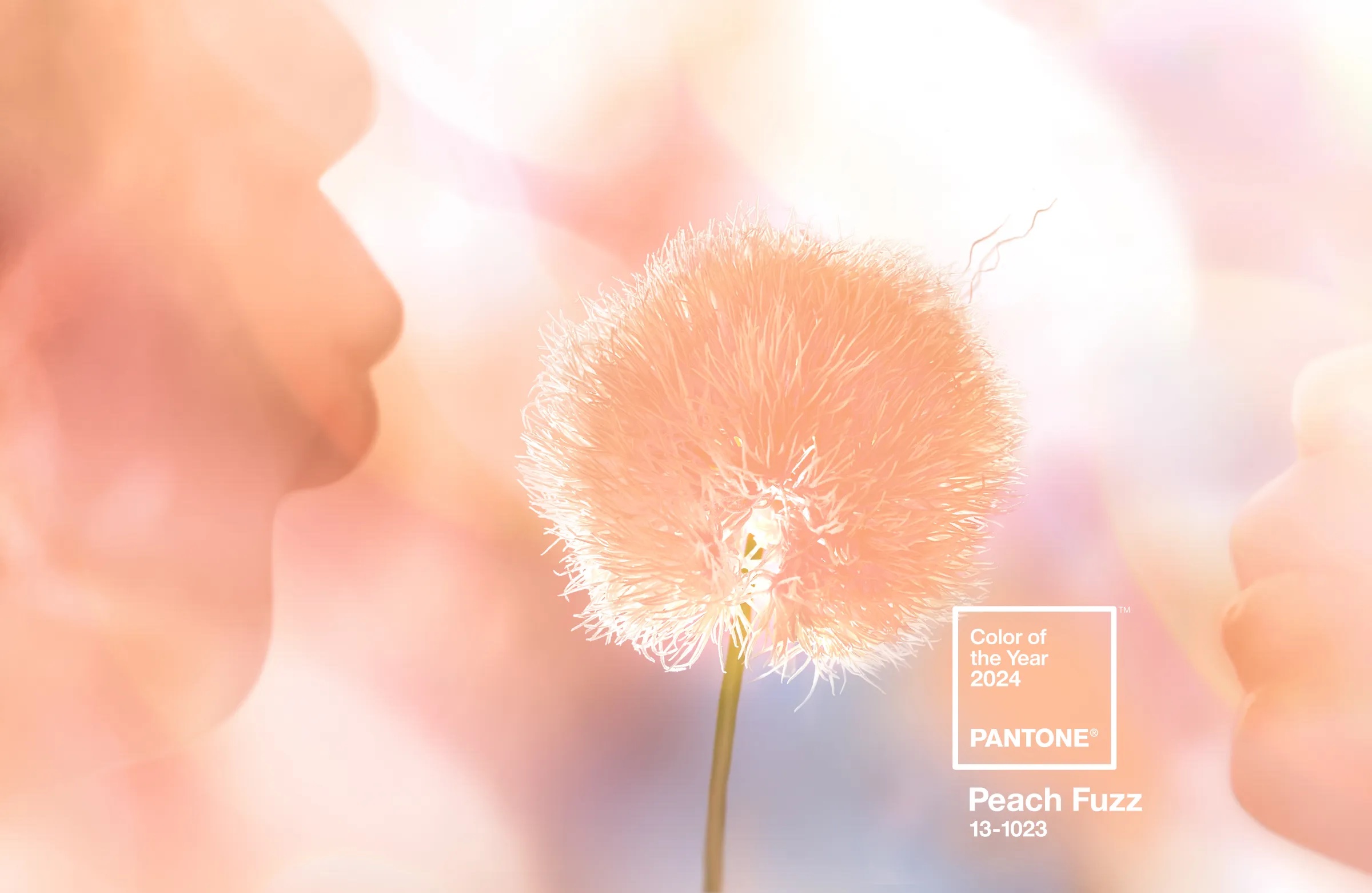
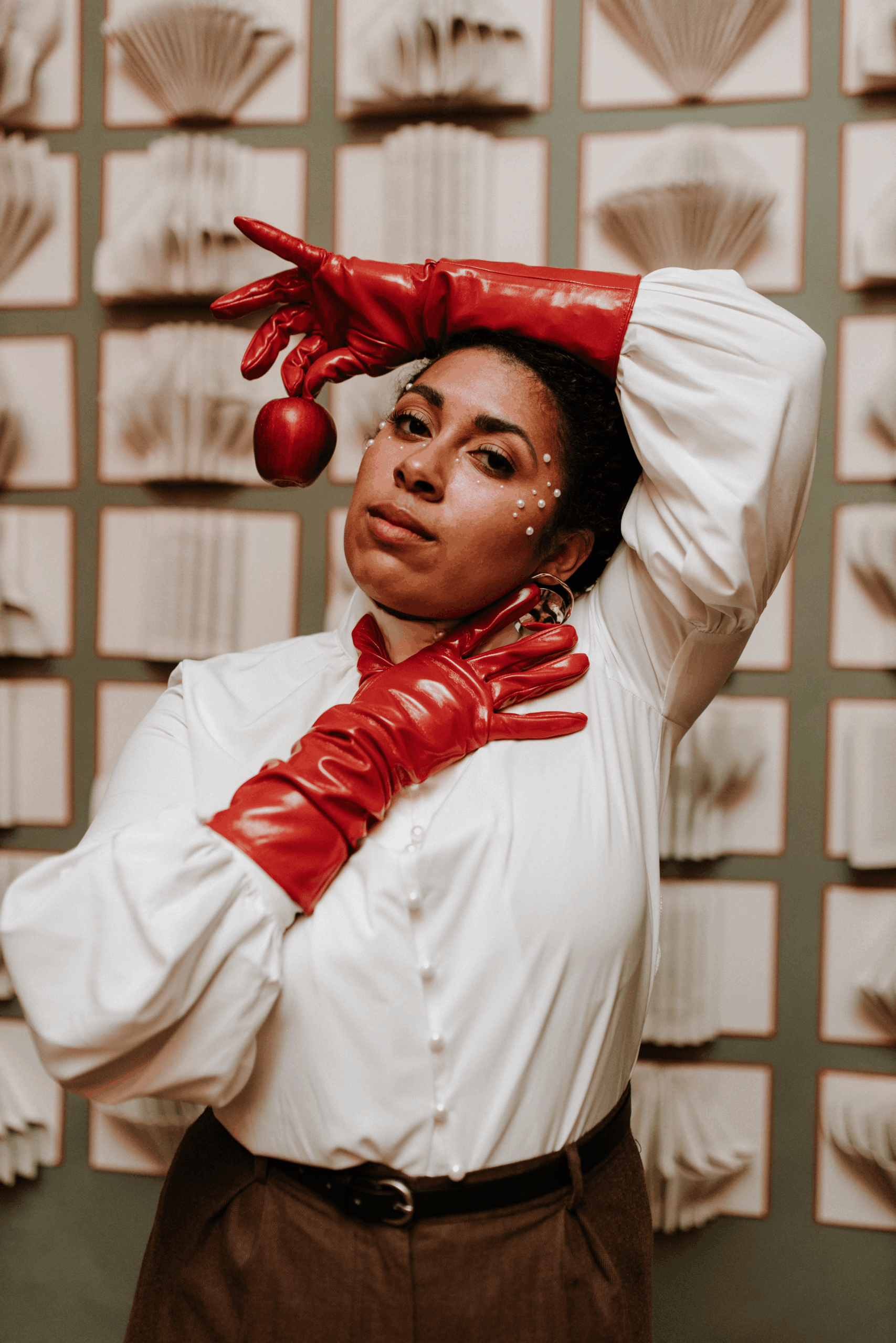
Yesterday, Pantone announced the 2024 Color of the Year as Peach Fuzz: a velvety gentle yet spirited peach. Dreamily dancing between pink and orange, Peach Fuzz is the vibrant first impression that welcomes in new beginnings with a warm smile, while making you feel right at home.
This warm and cozy shade communicates a celebration of closeness, caring, and collaboration. So it’s best used for brands that speak to people’s desire for togetherness and feeling cared for.
In a year of such change and conflict, this color promises a bit of optimism, positivity, and hope for the year ahead. When used intentionally, this could be a color to show your people that your brand is a safe place to land.
But first, a note on strategy.
How to Use the Color of the Year in Your Brand
When you’re picking colors, fonts, and design elements for your brand, always lead with strategy. Consider who your audience is, what they’re currently experiencing in this season of life, what your brand offers them, and how you want them to feel when they encounter your brand.
I highly advise against simply following a trend or going with the crowd and instead recommend you intentionally choose the colors you use on your website, social graphics, logos, signage, and other brand expressions so that they create a consistent experience that’s aligned with how you want people to feel. Because brands that make people feel something tend to foster greater buy-in, trust, and loyalty from their audience.
What kinds of brands Peach Fuzz is a good fit for:
Since this hue is perfect for brands that celebrate connection, it’s also a great fit for brands that seek to foster greater connection and community in the world and within their audience. They want to help their people enjoy their life, give them something real to belong to, and foster intimacy and passion – whether that’s in relationships of all kinds or within their work. (This 5-minute read on the three brand archetypes motivated by connection is also for you, if that’s the case!)
So if your brand resonates with feeling called to create something worth belonging to; believing passion is what makes anything worth doing; or reminding us to live a little more colorfully, you might consider exploring the following color palette and font ideas to get you going with implementing the 2024 Color of the Year in your brand.
Ways to incorporate the color of the year in your designs
So keeping that intention in mind – if any of the above about warmth, welcoming, and connection resonates with the feeling you want to evoke when people encounter you or your brand, you can consider incorporating the color of the year by:
🍑 Using photos with peach accents that add a warm optimism to your brand experience, celebrating that anything is possible
🍑 Grabbing a vibrant notebook or accessory for your next brand photoshoot or content session for that unexpected pop of color that catches the eye
🍑 Layering in a handwritten accent font to your designs (like these beauties from Jen Wagner) in a welcoming hue to add that warm personal touch to your site, social graphics, or emails
🍑 Adding some energetic art to your store, studio, or business space (Check out Katie Wyer Art or Louisa Djuric Art, two incredibly imaginative and inspired women)
🍑 Creating some new textures, patterns, or packaging designs for a product variation that feels like Springtime
How to Pair It With Other Colors to Evoke Different Feelings


Remember that you can also play around with shade variations to make this color totally your own. Try a tool like Coolors.co to explore hues and other pairings!
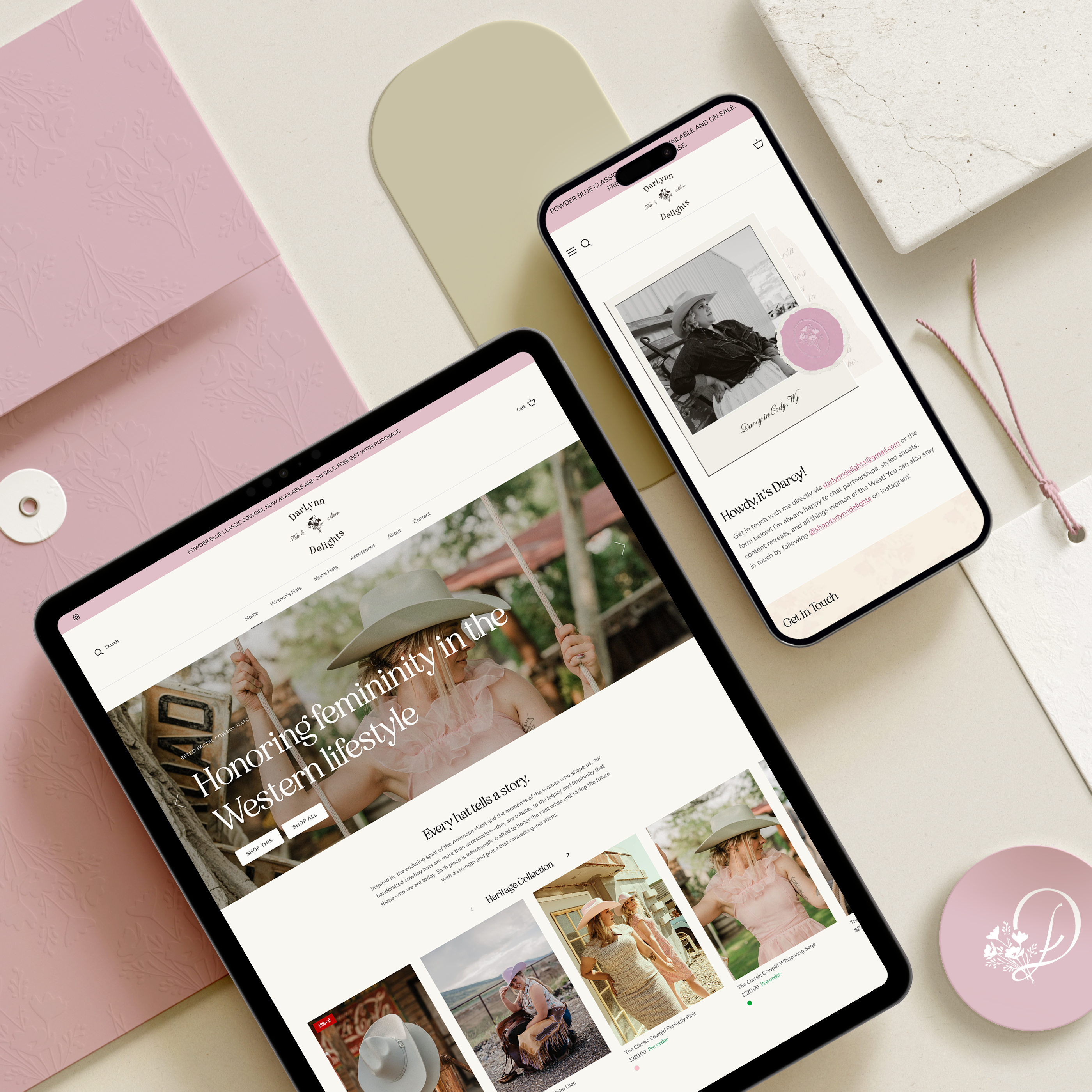
How I’m Using the Color of the Year in a Recent Project
This week, Jade Alamos Illustrations and I finalized the visual direction for her new Shopify website and it was so fun to see the peachy tone we had landed on announced as the Color of the Year. I’m taking it as a sign that it’ll be one of Jade’s best and brightest years yet.
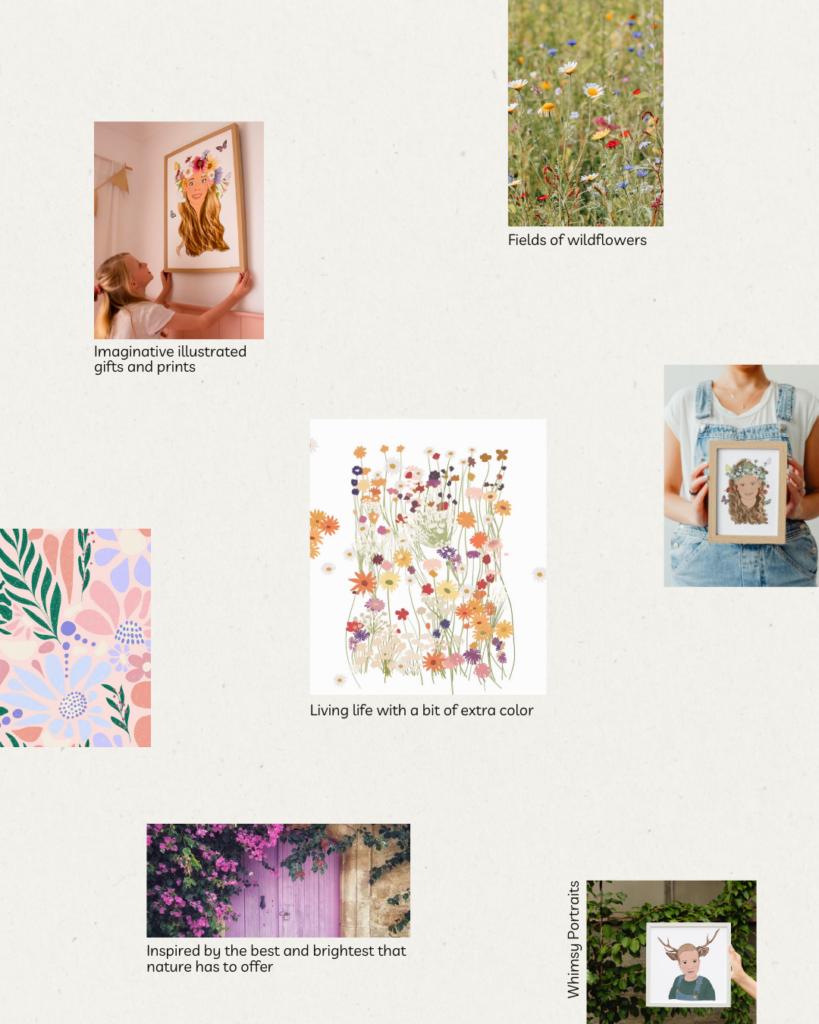
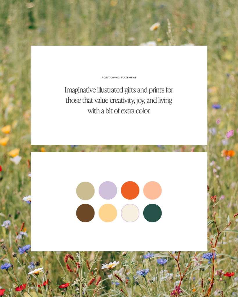
We’re balancing energetic brights with grounding neutrals to create an experience that feels equal parts like imagination-run-wild and coming home. We’re sourcing lots of inspiration from wildflower fields and curious walks in nature.
Jade creates imaginative illustrated gifts and prints for those who value creativity, joy, and living with a bit of extra color. So Peach Fuzz was the perfect accent color for her brand because her work brings people together. Her process is intimate and personal and her creations bring out the best and brightness of nature and life.
Check out her work @jadeamalosillustrations and be on the lookout for her vibrant Shopify website coming soon!
& if you’re looking for some backup as you explore how you want to show up in the world with your brand as your wildly unapologetic self, I’d love to explore that with you. Click here to inquire and let’s meet up on a connection call to get started!
Featured photo courtesy of Pantone(c) PhotoIris2021 | Dreamstime.com


")


Read the Comments +