


Mood boards are best used for roughly gathering inspiration. To find a meaningful strategy, you need to look at the underlying patterns in what you’ve gathered. So creating a concept board is a great next step in going to a deeper and more connection-focused level of design.
When you’re suddenly staring down a Canva template and scrolling through a bunch of photos of people smiling into their coffee, the whole process can get a little questionable and downright hopeless.
The proof is in these actual comments I’ve gotten from other creatives and entrepreneurs who were fighting their way through a brand refresh and making mood boards.
- “Okay, I added a bunch of pictures but there’s NO WAY I want to use these anywhere.”
- “This took me days. I don’t think the colors are right?”
- “What am I supposed to do? Add a bunch of photos of my ideal client?”
- “How do I use this now? …Do I want to use it?”
If you’re doing a DIY brand refresh or sourcing new content for your website and social accounts, try creating a concept board where you intentionally lay out the strategy behind each design choice you’re facing – colors, fonts, photos, and design.
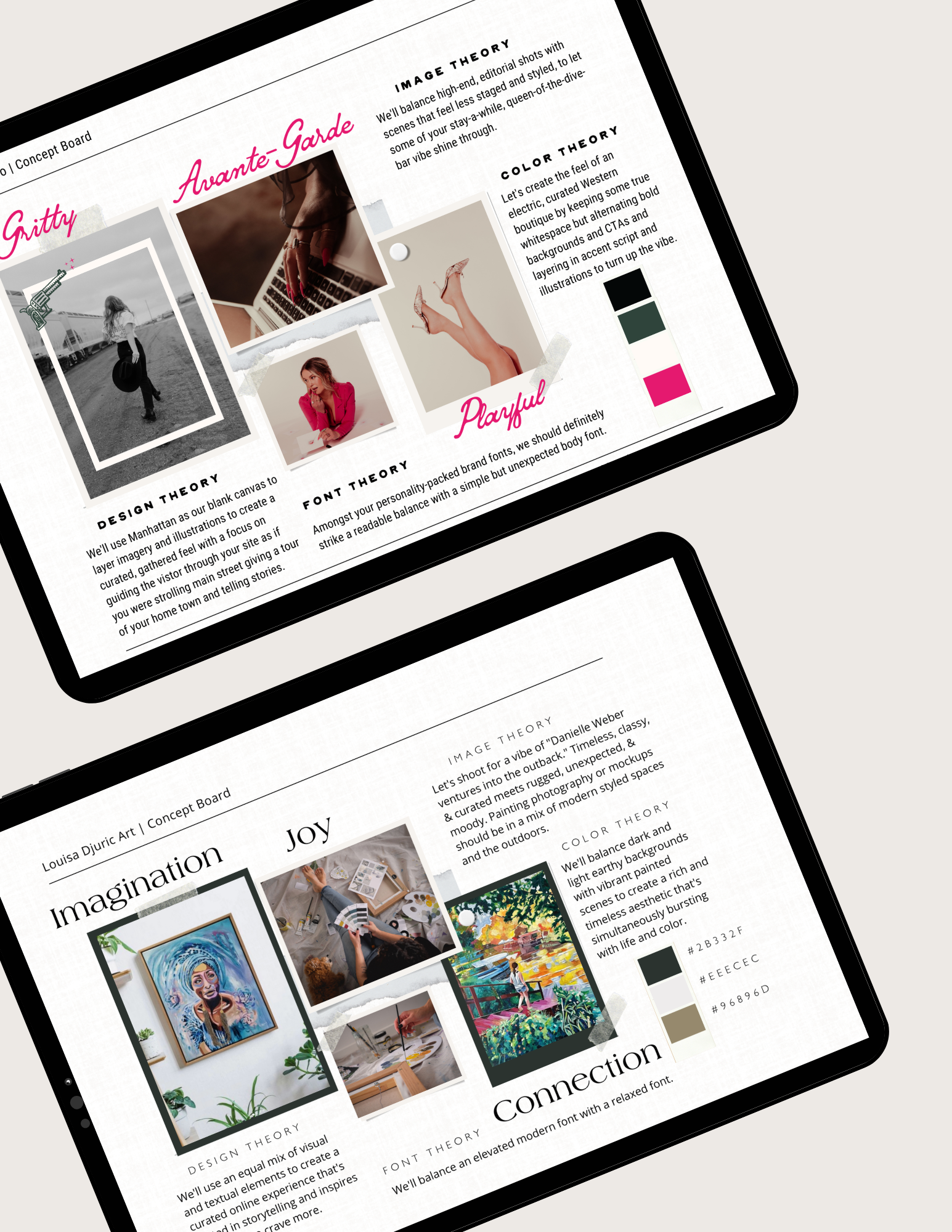
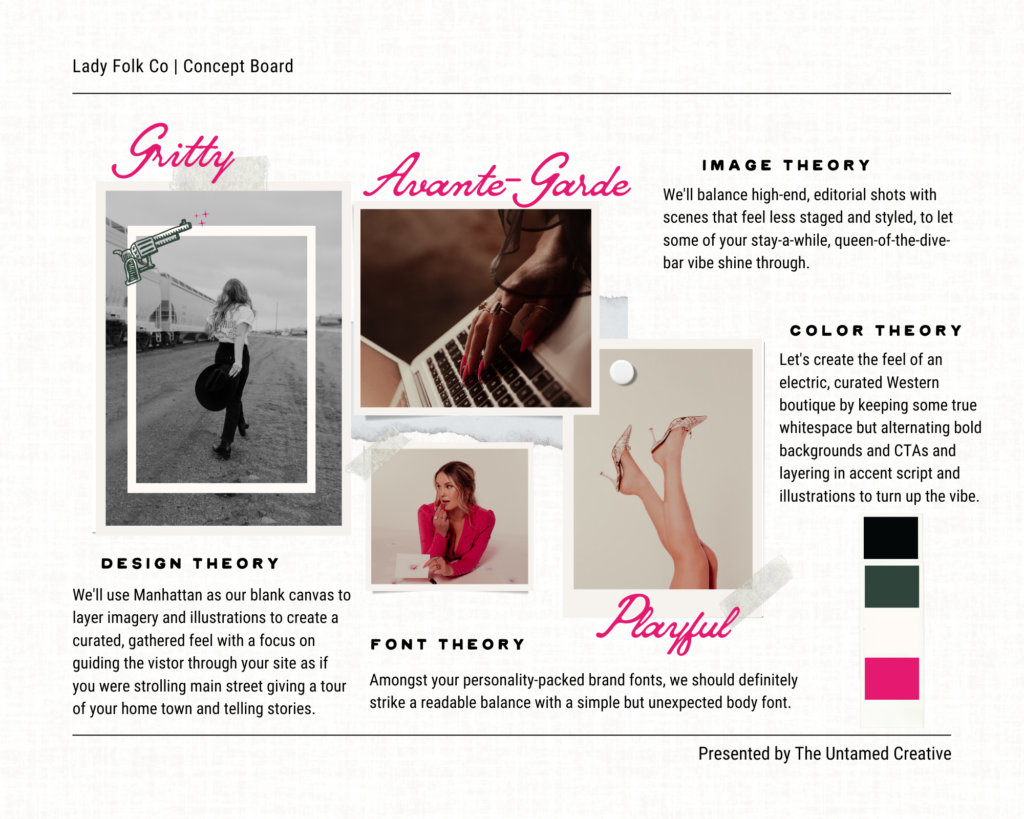
Below is a concept board I created for a client this year. I developed it following an extensive branding process, but it can still be used to transform ideas into meaningful design choices at any stage.
The clients were creating a virtual therapy service focused on cultivating a deeper understanding of the human experience. The catch? They said they didn’t want any pictures of people, technology, wellness, or feeling better. Honestly, I had no idea how I was going to pull that off. Cue, the concept board.
Once I teased out a few key values – being raw and unfiltered and providing a safe space – balance began to develop as the underlying theme. Balancing light and dark, calm and edgy, and professional and relatable.
That translated into the following theories:
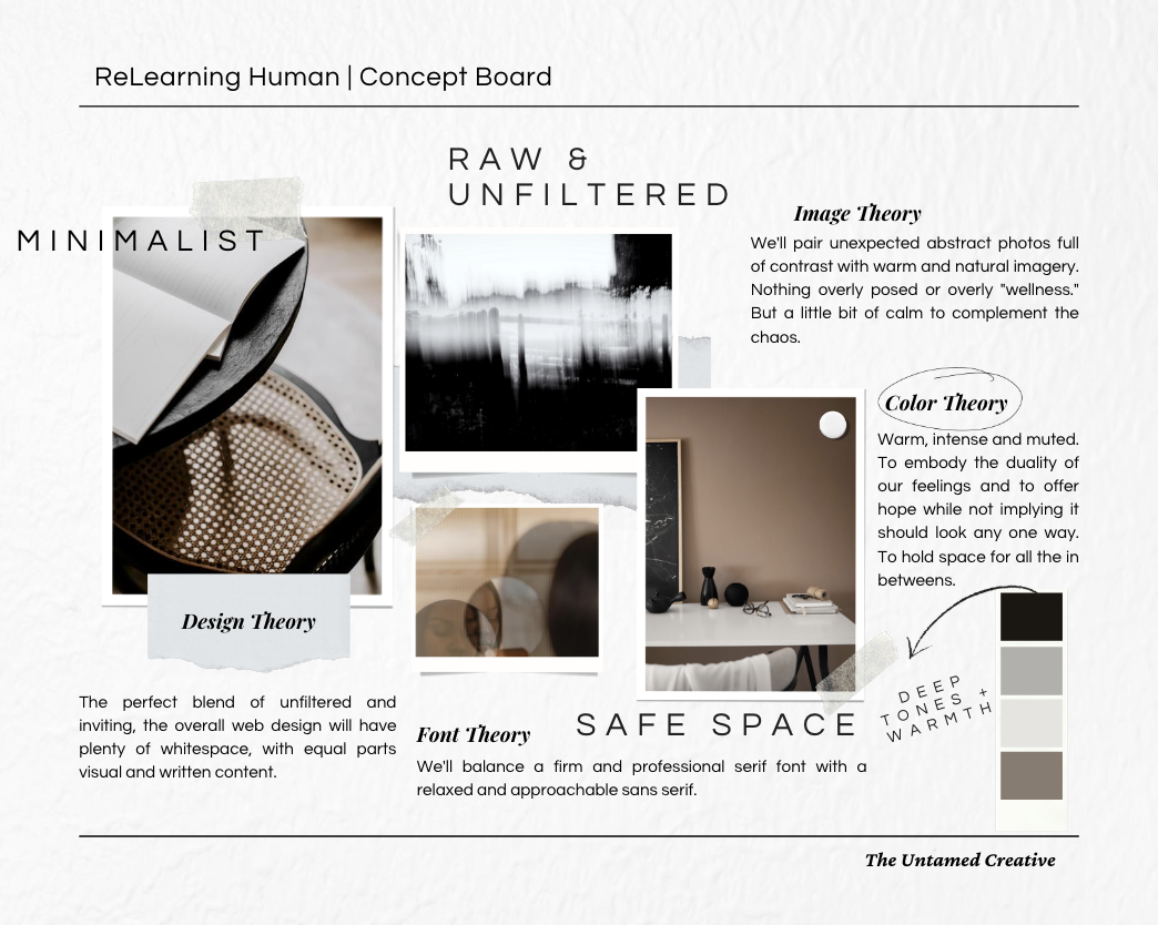
With these theories outlined and spelled out, sourcing photos and choosing fonts became easier. Instead of scrolling endlessly through stock photo sites looking for something random to jump off from, I had a guide that led me to source black and white and neutral-toned photos of blurry subjects and clean spaces.

So if your mood board isn’t working for you. Try these steps to gain more clarity about your refresh:
- If you already have a set of brand guidelines plug in three values or descriptive words about how you want your brand to be presented. You could also use three descriptors of how you want people to feel when they encounter your brand.
- Fill out the image theory section. Instead of writing out exactly what you want to be the subject of your photos, explain the vibe you want your photos to give off.
- Fill out the color theory section. Do you want your main colors to be bright and bubbly, dark and intense, or neutral with pops of color? Use this section to highlight the emotions and feelings your colors will evoke.
- Fill out the design theory section. If the concept is for a photographer, you probably want the design to be mainly photos with just enough text to give insight into their approach, process, and testimonials. If the concept is for a writer, you probably want to allow their writing to shine by complimenting it with a few visuals here and there.
- Fill out the font theory section. Think back to how you want this brand to be presented to the world. If it’s for a home improvement contractor, you probably want to demonstrate reliability, consistency, and professionalism through your fonts. If it’s for an artist, you might want a bold and unique accent font thrown in the mix.
Whether you’re sourcing photos for an existing brand or starting from scratch, this exercise can bring clarity to the process and will help ensure consistency no matter where people meet the brand. Whether it’s on Instagram, through Google, or on the sidewalk, the brand will look and feel familiar. And we trust familiar.
Want the exact template I use for all my projects? Get it here and be sure to let me know how it works out for your next project!
Free
Inspiration
recently on the journal
Previous Post:
Your free guide to timeless and universal strategy, story, and style.


